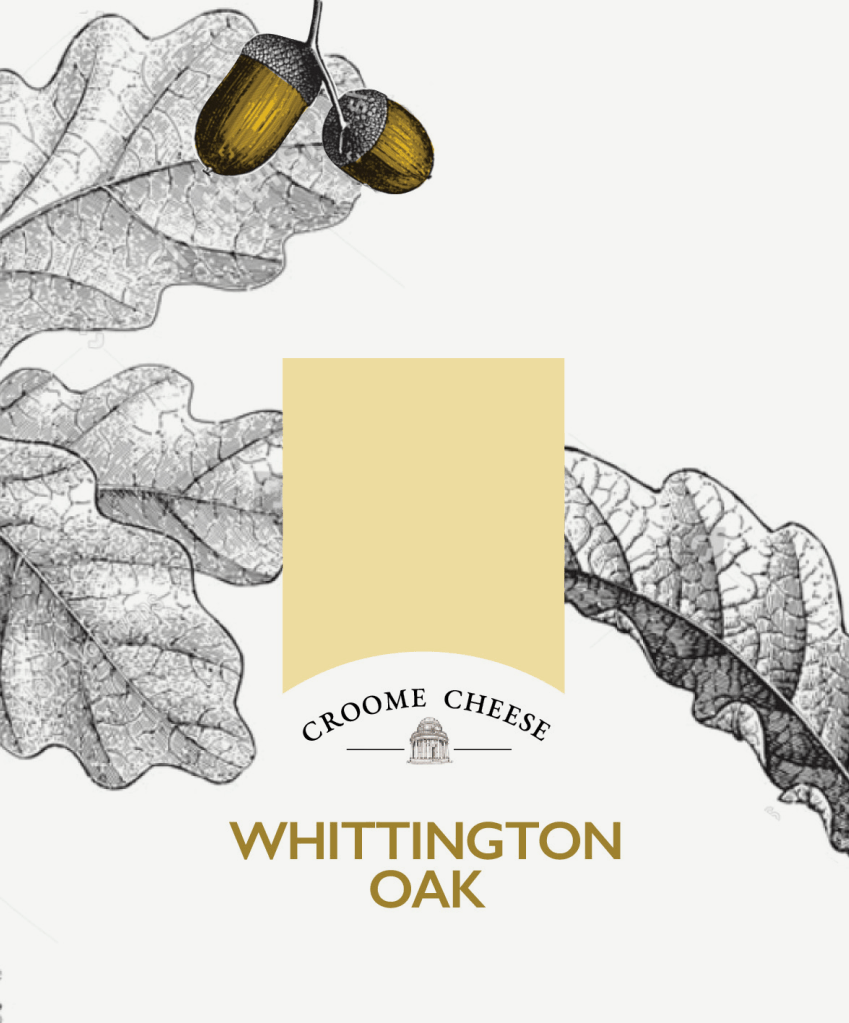
The Ingredients are the Hero
A marketer tasked with developing their brand and new packaging sought me out to create the innovative design. The ingredients are the hero of everything they do as the client had been inspired to make their cheeses with the flavours of the estate they grew up on for which the cheese is named.
The Journey to an Approved Look
Here I’ve shown part of the creative process. You can see the journey from the original concept through various amends following feedback. One of the key decisions we made was to use one typeface for all products along with changing the names to be more fun.
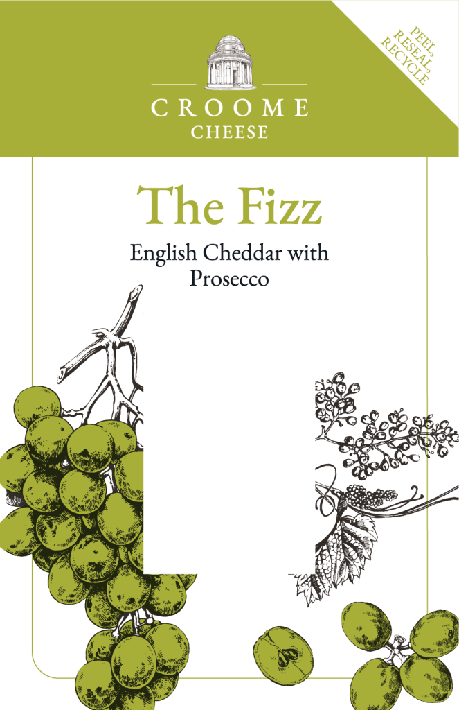
Transparency Shows the Product
The original circles are labels for deeply coloured wax truckles, followed by labels that were ultimately produced. We went for a transparent panel to enable the consumer to see straight into the cheese and the luscious flavourings.
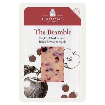
Resealable, Recyclable Packaged Cheese Available at Waitrose
The last image is from the Waitrose website where this cheese is being sold. This was such an amazing output of the project in that was a main aim of the client hiring us in the first place — to get in to Waitrose.